EngagementHQ
Web based platform for online community engagement for governments

EngagementHQ (eHQ) by Bang The Table (BTT) is the world's leading public consultation cloud-based platform, used by governments to encourage public awareness, participation and feedback collection. The platform helps crowdsource information with out-of-the-box participation toolsets and purpose-built analytics, reducing time to decision and ensuring community voices are heard.
The design of eHQ's platform was outdated, and it also carried technical debt. The business had a desire to modernize the design.
My Role & The Team
I was responsible for all design decisions and deliverables regarding revamping the platform and also helped write support articles for existing and new features. The team consisted of a junior designer, two PMs and three developers.
The Process
As a part of the Agile Scrum development process, we had an iterative loop of design and usability testing that worked in a loop until it reached a satisfactory level for the stakeholders. It was then pushed into production.

Tools Used
Sketch, Figma, Invision, & Mixpanel
Challenges
With eHQ's legacy platform:
- There was very little documentation. Over the years functionality had been modified but hadn't been documented.
- High level userflows were missing
- Having no design system, parts of the platform looked different.
- For public-facing pages, the UI was to be modified only by styling and the structure was not to be touched. This was because the backend for these pages was older and was going to be taken up later.
- The experience across the application hadn't changed in 6-7 years.
Planning:
There were three areas of the application we wanted to improve as a priority:
A. Frequently used features
B. Allow admins more control over platform
C. Update public facing pages
Personas & Designs
There had been done some amount of research over the years prior to starting on the project, that
included personas, journey mapping and IA.
Two primary users - Admins or Community Managers who set up projects and Community users or
participants who give feedback and vote on published projects.

Old platform sample screens.

Existing work done in understanding the user.

Mapping out IA and evaluating userflows
Solution
The first step was to start with existing commonly used IA and user flows. For userflows We
identified areas where they could be improved. For features that didn't have documentation of IA, we
mapped it out. Feature that were prioritised:
- Platform Settings: This was crutial in setting up the platform.
- Project management and creation page: crutial for Community managers in publishing features.
- Newsletter creation flow: Creating a linear process so that newsletters that were being sent to users were easier to create and send.
- Homepage Editor: Giving admins more control over how their community homepages looked.
- Building on the Ant Design system: Customising the Ant Design System to suit our needs.
Settings Page
Global settings for a project dictate how all consultancies receive feedback, how paticipants can share, notifications to participants and who is allowed to moderate discussions. The issue with the existing design was that information wasn't organised logically, a lot of microcopy was written by engineering and was confusing, and some fields were redundant or no longer had a purpose.

The legacy platform v/s the renewed platform

Renewed settings screens
Project Management Page (PMP)
If a local government wants to create awareness of a project they start by creating a project page. The current PMP didn't take advantage of modern CMS applications. It was difficult to visualise what the page looked like unless previewed. To overcome this challange, the revised PMP was structured so it reflected, like modern WYSIWYG editors, what the published page would look like.
The listening tools and widgets that were participant facing were also relooked at. Some needed only a UI facelift, while others needed a rework on how they were set up. Tools and widgets now could be edited via a drawer that was an overlay on the project page, giving context to the Admin.

PMP page - legacy v/s renewed

PMP page - creating a project in 3 easy steps

Widgets - Using widgets via drawer to give context
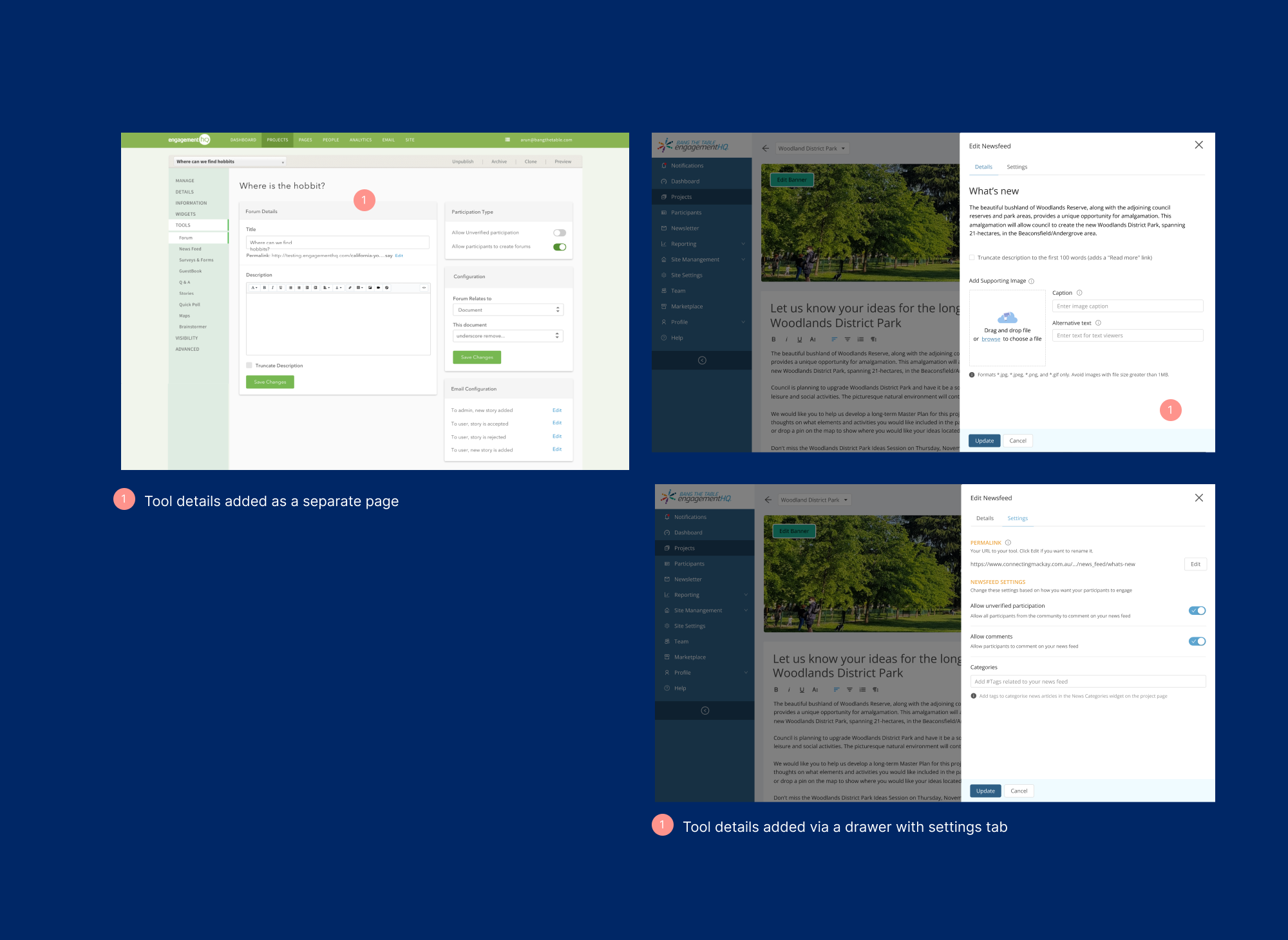
Tools - Using tools via drawer to give context
Newsletters
A newsletter goes out to participants on the progress of various consultancies as well as related consultancies. The legacy platform had this embedded deep in settings and was difficult to edit.

The newsletter creation showing the steps in creation.
Home Page Editor
The Home Page Editor was a new feature to give more control to admins to design their home pages that contain all their consultancies. This used a drag and drop functionality with templates and themes.

The home page editor with themes and functionality.
Design System
In helping speed up development time, the Ant Design System was used as the base system upon which customisations were made. This was then used as a common library used across the platform.

The BTT design system